
Bad Breadth
And a shot of mouthwash

We’ve talked about how the VIX Mix refused to confirm the recent all-time highs for US equity markets, suggesting that investors were hedging their bets. Today, we’ll look at a few measures of market breadth that also indicate that not everyone is moving in sync with the steep rally off the end-of-March low.
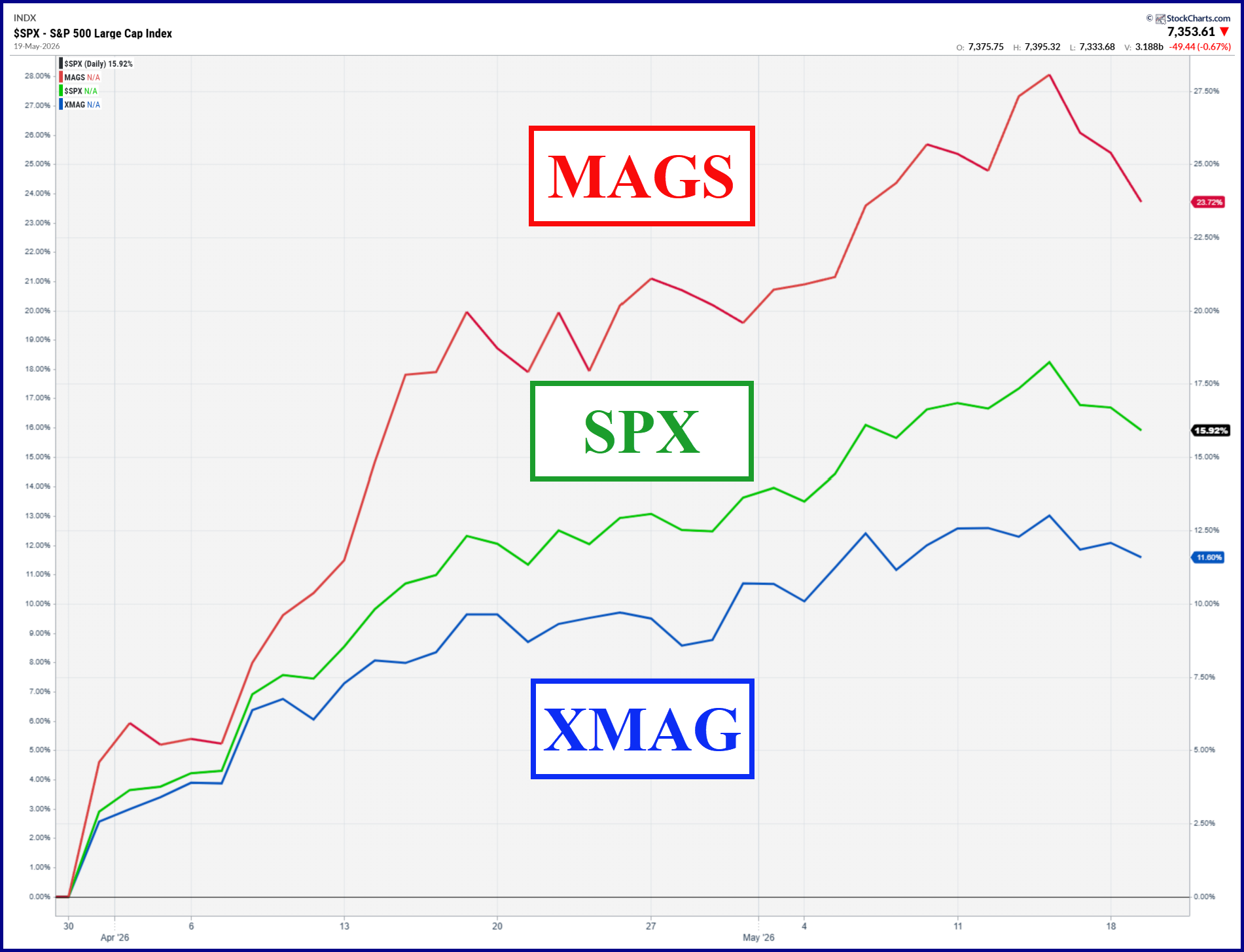
First is a simple chart of the S&P 500 with an ETF representing the Magnificent Seven (MAGS) along with one that tracks the other 493 stocks (XMAG). As you can see, the recent rally has been driven by the biggest of the big caps while the remainder have done OK but detracted.
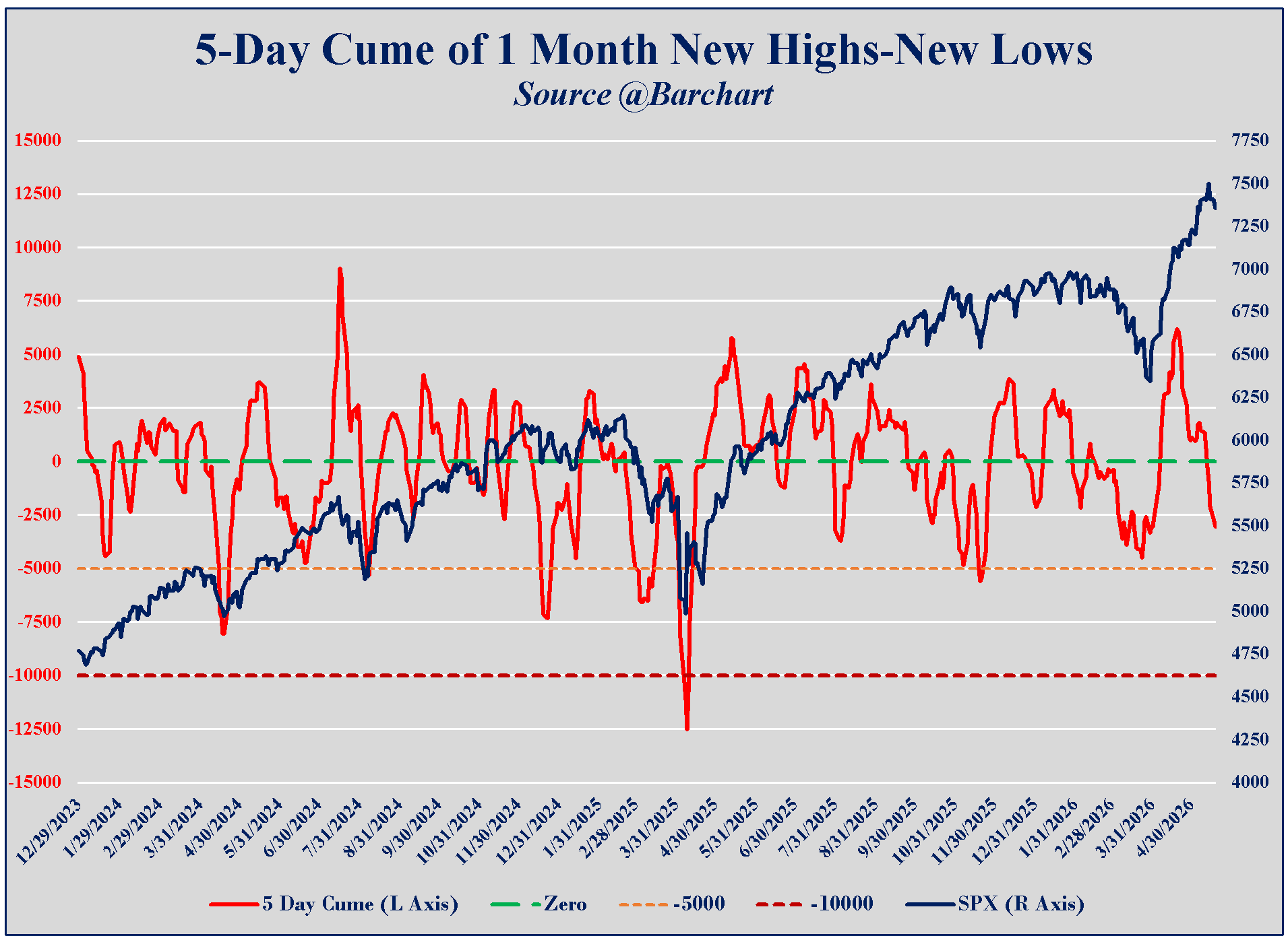
This next chart comes from the work of Dr. Alexander Elder. If you fancy yourself a trader and don’t know Dr. Elder, then I recommend you spend some time fixing that with one or more of his books. This particular take uses the 5-day cumulative total of monthly net new highs as a measure of market strength. Two observations on the recent action. A bit hard to see, but the cume NHNL actually bottomed before SPX did at the end of March (bullish divergence). On the other hand, easy to see that NHNL peaked in April and has retraced almost the entire move off the bottom. Fewer stocks are making new highs even as the index has marched higher. Not bullish.
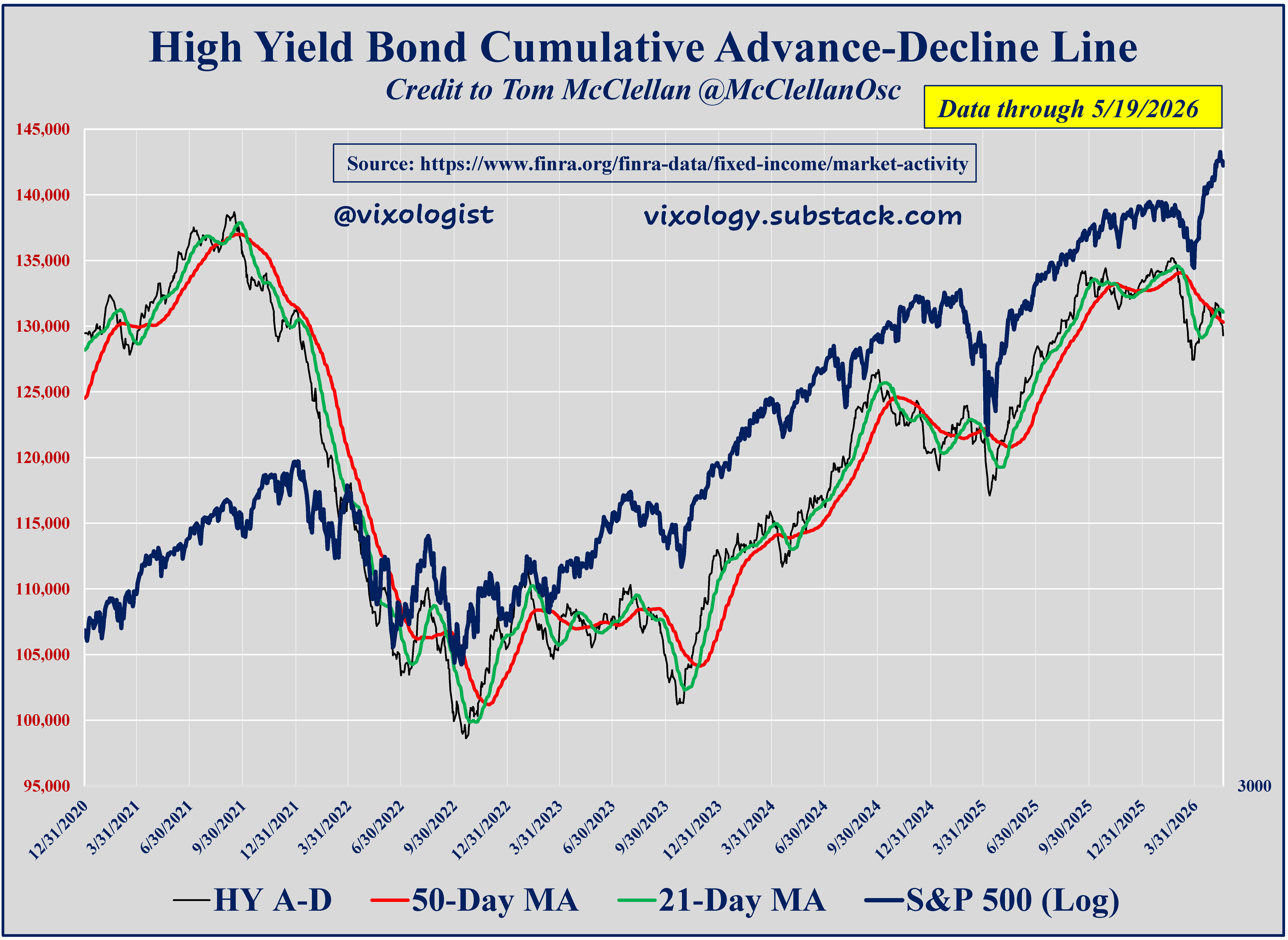
Moving over to credit markets, this next chart should be familiar by now. Essentially a measure of breadth for the publicly-traded high yield market. It has lost the script here and that is also not bullish for equities.
Let me be clear. Bad breadth is a bearish divergence in a rising stock market and deserves careful attention. But it doesn’t mean we’re gonna crash. A few pieces of good news or good data can turn things around pretty quickly. One day at a time.
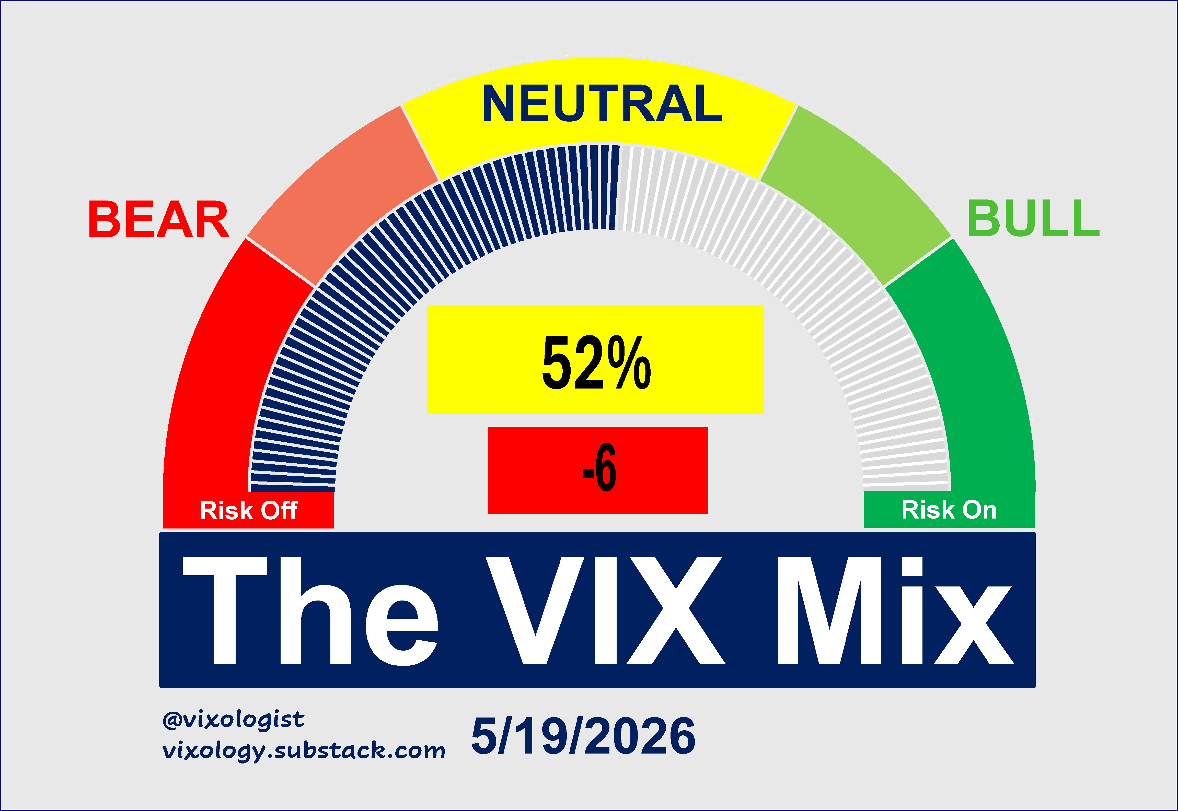
Back to our regular broadcast, the VIX Mix also continues to show a bearish divergence relative to SPX and US equities more broadly. The MA10 trend line is pointing south and recent days have moved away from the bullish clusters seen during the better days of the recent rally.
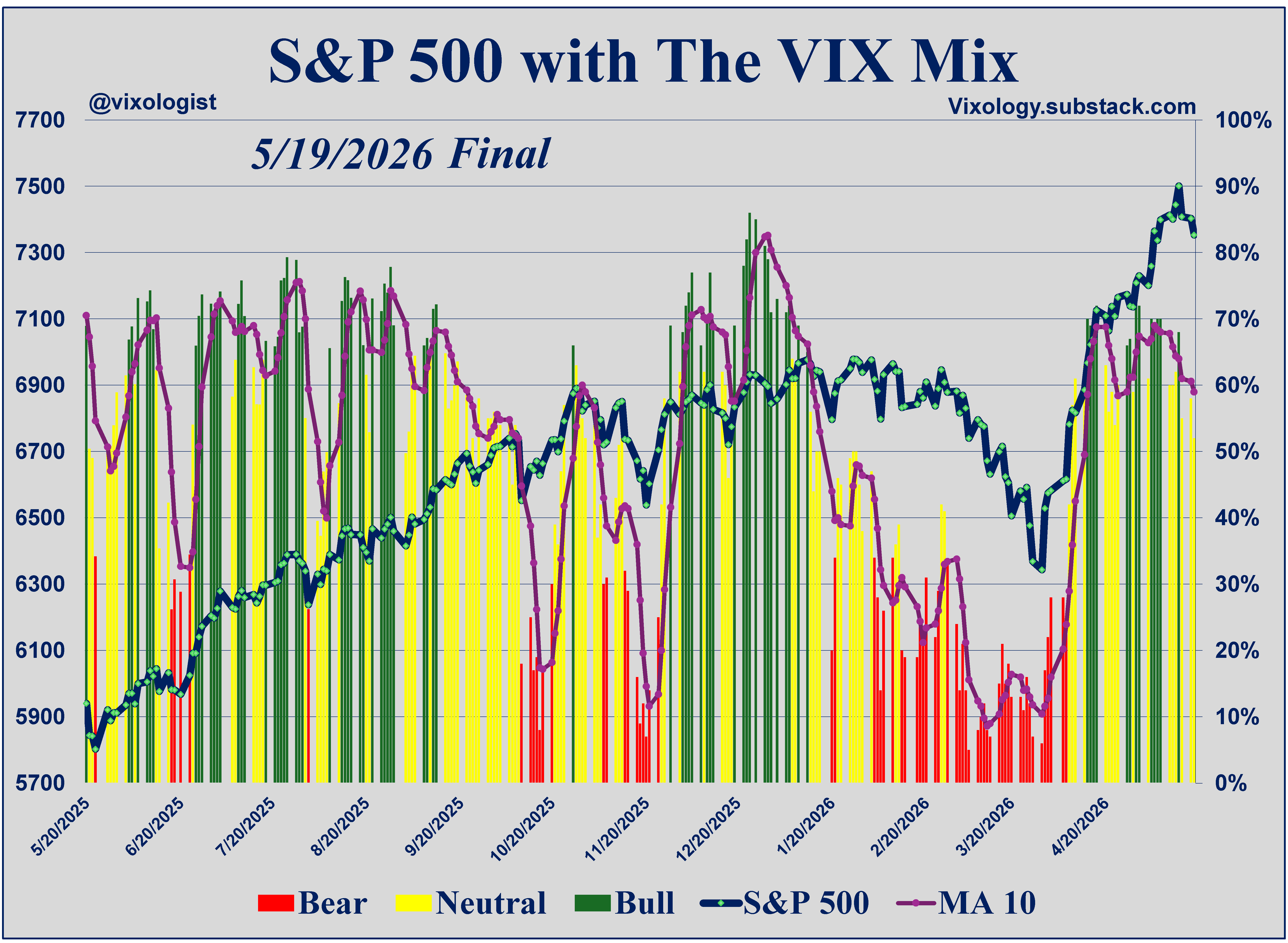
The composite gauge came to rest yesterday at a neutral 52%, down six points from the day before. 12 of 17 components are also stuck in the yellow band while two are bullish and three are bearish.
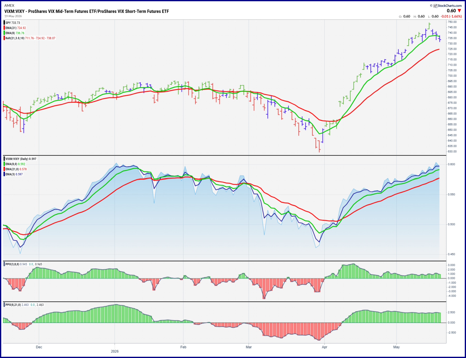
But in the midst of all this negativity, one of our favorite weather vanes continues to show a favorable tailwind for all things short vol (long risk assets). That would be the ratio of VIXM to VIXY, a proxy for the shape of the VIX futures term structure. It’s pretty much a screaming bull right now. I will just add that bad turns for the equity market have never come along while this ratio is showing green in the bottom panes.
So there you have it. The markets are showing clear signs of bad breadth while also delivering support to the bulls. If it were easy………..
All content presented here is for informational and educational purposes only. Distribution of any content to any persons other than the recipient is unauthorized. Furthermore, any alteration of content presented here is prohibited. By accepting delivery of this presentation, the reader agrees to the foregoing. Certain information presented herein has been obtained from third-party sources considered to be reliable, but there is no guarantee of completeness or accuracy and it should not be relied upon as such. There is no obligation to update or correct any information presented. Readers should not treat any statement, opinion or viewpoint expressed herein as a solicitation or recommendation to buy or sell any security or follow any investment strategy. This material does not consider the investment objectives, financial situation, or needs of any particular reader. Readers should seek advice from a qualified financial or investment advisor prior to making any investment decision.
The good thing about trading for time decay is that even when signals are mixed like this, I can count on time to pass so I can collect that sweet theta.